Graphic Design
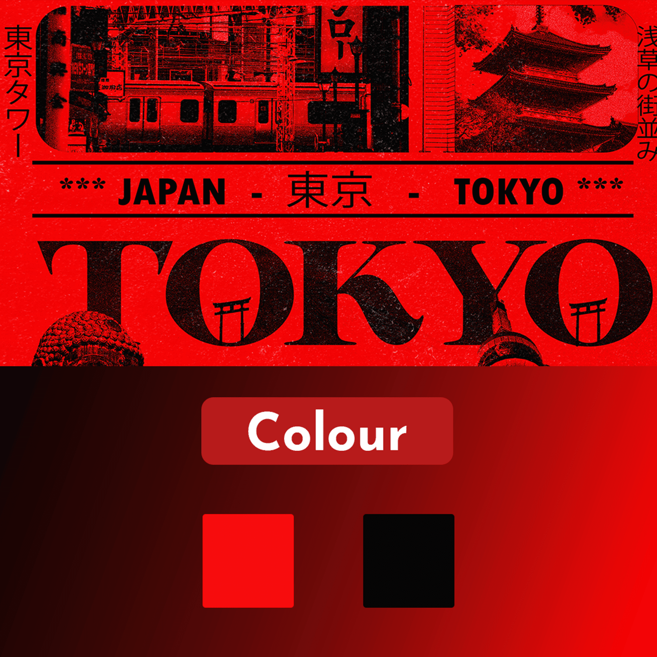
Tokyo – Travel & Cultural Poster Design
A bold poster design that leverages the powerful combination of red and black to communicate intensity, strength, and visual impact.
Year :
2025
Industry :
Cultural Poster Design

Problem :
In poster design, one of the recurring challenges is capturing attention in a cluttered visual environment. Many posters fail to stand out because they use safe or muted color palettes that blend into the background. For this project, the intention was to explore how strong, high-contrast colors could be applied in a minimal yet powerful layout. The goal was to ensure that the design leaves an immediate impression while still maintaining professional balance.

Solution :
The use of red and black was chosen deliberately to embody energy, urgency, and authority. Red draws attention instantly, while black grounds the design, giving it sophistication and strength. By combining these two colors, the poster creates a striking contrast that communicates intensity without relying on excessive elements. Careful attention was given to typography and spacing to allow the colors themselves to drive the emotional tone of the design.

Challenge :
Working with strong colors like red and black poses the risk of overpowering the composition or making the design feel aggressive. The challenge was to strike a balance where the poster feels bold and commanding but not chaotic or uncomfortable to view. This required experimenting with gradients, contrast ratios, and typography alignment until the composition achieved both harmony and impact. Another challenge was ensuring that the message remains clear and not overshadowed by the dramatic color scheme.
Summary :
This poster demonstrates how a simple yet bold color palette can be used strategically to amplify a message. The design achieved the intended effect of creating intensity and drawing the viewer’s focus immediately. By carefully balancing color dominance with typography and layout, the project highlights how red and black can be transformed into more than just aesthetic choices—they become central storytelling elements. The result is a powerful visual piece that embodies clarity, contrast, and emotion.

More Projects


Graphic Design
Tokyo – Travel & Cultural Poster Design
A bold poster design that leverages the powerful combination of red and black to communicate intensity, strength, and visual impact.
Year :
2025
Industry :
Cultural Poster Design
Problem :
In poster design, one of the recurring challenges is capturing attention in a cluttered visual environment. Many posters fail to stand out because they use safe or muted color palettes that blend into the background. For this project, the intention was to explore how strong, high-contrast colors could be applied in a minimal yet powerful layout. The goal was to ensure that the design leaves an immediate impression while still maintaining professional balance.
Solution :
The use of red and black was chosen deliberately to embody energy, urgency, and authority. Red draws attention instantly, while black grounds the design, giving it sophistication and strength. By combining these two colors, the poster creates a striking contrast that communicates intensity without relying on excessive elements. Careful attention was given to typography and spacing to allow the colors themselves to drive the emotional tone of the design.
Challenge :
Working with strong colors like red and black poses the risk of overpowering the composition or making the design feel aggressive. The challenge was to strike a balance where the poster feels bold and commanding but not chaotic or uncomfortable to view. This required experimenting with gradients, contrast ratios, and typography alignment until the composition achieved both harmony and impact. Another challenge was ensuring that the message remains clear and not overshadowed by the dramatic color scheme.
Summary :
This poster demonstrates how a simple yet bold color palette can be used strategically to amplify a message. The design achieved the intended effect of creating intensity and drawing the viewer’s focus immediately. By carefully balancing color dominance with typography and layout, the project highlights how red and black can be transformed into more than just aesthetic choices—they become central storytelling elements. The result is a powerful visual piece that embodies clarity, contrast, and emotion.
More Projects
Graphic Design
Tokyo – Travel & Cultural Poster Design
A bold poster design that leverages the powerful combination of red and black to communicate intensity, strength, and visual impact.
Year :
2025
Industry :
Cultural Poster Design
Problem :
In poster design, one of the recurring challenges is capturing attention in a cluttered visual environment. Many posters fail to stand out because they use safe or muted color palettes that blend into the background. For this project, the intention was to explore how strong, high-contrast colors could be applied in a minimal yet powerful layout. The goal was to ensure that the design leaves an immediate impression while still maintaining professional balance.
Solution :
The use of red and black was chosen deliberately to embody energy, urgency, and authority. Red draws attention instantly, while black grounds the design, giving it sophistication and strength. By combining these two colors, the poster creates a striking contrast that communicates intensity without relying on excessive elements. Careful attention was given to typography and spacing to allow the colors themselves to drive the emotional tone of the design.
Challenge :
Working with strong colors like red and black poses the risk of overpowering the composition or making the design feel aggressive. The challenge was to strike a balance where the poster feels bold and commanding but not chaotic or uncomfortable to view. This required experimenting with gradients, contrast ratios, and typography alignment until the composition achieved both harmony and impact. Another challenge was ensuring that the message remains clear and not overshadowed by the dramatic color scheme.
Summary :
This poster demonstrates how a simple yet bold color palette can be used strategically to amplify a message. The design achieved the intended effect of creating intensity and drawing the viewer’s focus immediately. By carefully balancing color dominance with typography and layout, the project highlights how red and black can be transformed into more than just aesthetic choices—they become central storytelling elements. The result is a powerful visual piece that embodies clarity, contrast, and emotion.